Free Download StyleWriter software World's Largest Writing Style, Word Usage, Readability and English Grammar Checker by Editor Software
| Free Articles
|
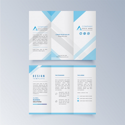
Help Me Write a Better Brochure Brochures are fantastic sales tools for many businesses. However, a hard-to-read brochure can turn potential customers off, so you need to make it as appealing as possible to your customers. The following simple guidelines will help you get the best out of your brochures. 1) A Picture Says a Thousand Words A good brochure has very little text. To convey a strong message without being wordy, choose a few effective pictures to include in your brochure. A picture delivers an instant message to your readers because it takes less time to process than reading. The best brochures will have relatively self-explanatory pictures coupled with a few lines of eye-catching text. 2) The Value of Call-Outs Call-outs are phrases in a slightly larger font that are embedded in a body of words, similar to a picture. For sections of your brochure that simply must have a fair amount of text, try using a call-out to steer your readers' eyes to something that will really grab their attention. Choose something particularly interesting. For example, imagine a paragraph in a technical brochure that contains a lot of data about hardware specifications. These details are important to your brochure, but are nevertheless fairly mundane to read. A well-placed call-out, like the one in this paragraph, can highlight an interesting bit of information that will help hold your audience longer. (Call-out in the above paragraph: A great call-out spices up your brochure.) 3) Make an Impact with Bullets A brochure offers a limited amount of communication space, so use bulleted lists to get people's attention efficiently. Readers will gravitate toward anything that stands out, which is why lists are a perfect way to convey important information. For example, it's better to write: a) Friendly service b) No waiting c) Satisfaction guarantee than it is to say "Our business provides friendly customer service with no waiting and a 100% satisfaction guarantee." Both methods deliver the same information, but the second method is very wordy and harder to process than the above bulleted list. 4) Focus on Formatting We've said it before, we'll say it again: do not put too much text into your brochure. Too much text overwhelms your audience. It's better to have some empty space to make your brochure easier on the eyes and give your readers some room to digest what your business has to offer. Don't try to cram more words in by using a tiny font size, either; your audience won't be fooled! In terms of font styles, be careful about how creative you get. In a brochure it can be interesting to have a couple of unique-looking fonts, but too many will take away from the overall effect. Try using a very simple font for your body text and a slightly more "fun" font for your headlines. Similarly, use caution with colors. It's great to have a nice background color to accent your pictures and text, but one that's too loud will distract readers from your brochure's message. Before sending your brochure to the printers, experiment with color combinations and get the opinions of colleagues you trust. Finally, consult your printers before choosing a paper type. The quality and finish of the paper will affect the readability of your brochure. Ask for advice about which finishes will look best with your brochure's colors, pictures, and text. Finally, don't be afraid to ask for a sample before you commit to a certain finish; your brochure is an important sales piece that needs just the right look to showcase your business. |